Pie Chart
You can use pie chart to show how certain data splits into different buckets
Basic
| Category | Amount |
|---|---|
| Rent | 500 |
| Groceries | 350 |
| Entertainment | 1050 |
| Repairs | 1200 |
| Utilities | 300 |
sqlseal
TABLE finances = table(0)

CHART {
	series: [{
		type: 'pie'
	}]
}
SELECT * FROM finances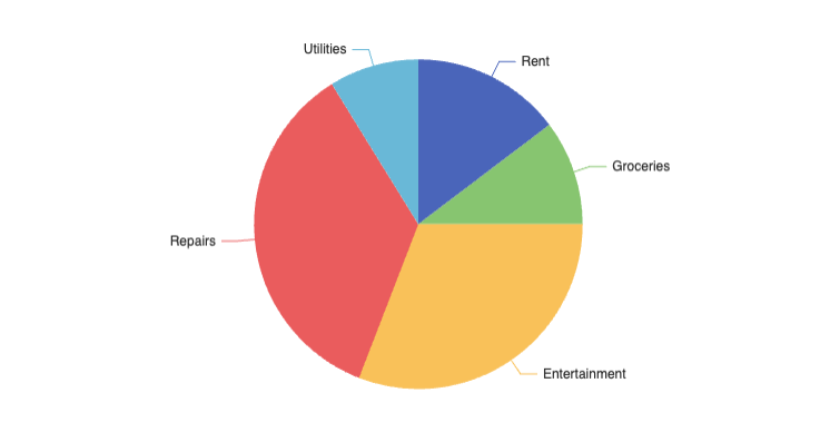
Ring Style (Doughnut)
You can make doughnut style charts (remove the middle) by specifying inner and outer radii:
sqlseal
TABLE finances = table(0)

CHART {
	series: [{
		type: 'pie',
        radius: ['40%', '70%']
	}]
}
SELECT * FROM finances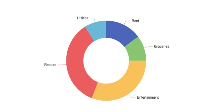
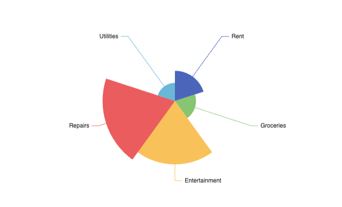
Nightingale Chart (Rose Chart)
You can present your data as a Nightingale chart. You can achieve them by adding roseType: 'area':
sqlseal
TABLE finances = table(0)

CHART {
	series: [{
		type: 'pie',
        roseType: 'area'
	}]
}
SELECT * FROM finances