Mixed Charts
You can mix and match charts together. If both chart types are drawn on the XY axis, you can display different dataseries next to each other.
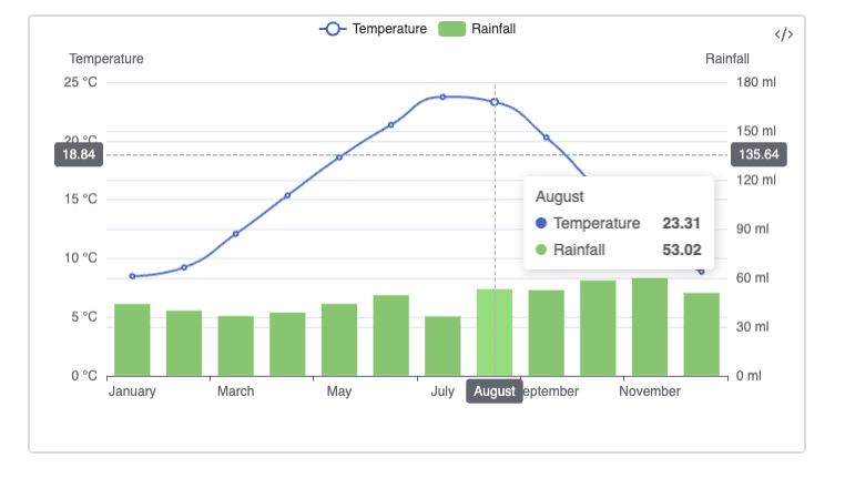
Basic Example
Below we display precipitation (as bar chart) and temperature (as a line chart) together. We also add interactive crosshair to inspect data in more details:
| Month | max_temp | min_temp | Sunshine | Rainfall |
|---|---|---|---|---|
| January | 8.47 | 3.36 | 44.42 | 43.93 |
| February | 9.21 | 3.22 | 66.11 | 39.85 |
| March | 12.07 | 4.66 | 109.71 | 36.52 |
| April | 15.35 | 6.02 | 152.85 | 38.63 |
| May | 18.59 | 9.06 | 198.68 | 43.99 |
| June | 21.37 | 12.04 | 198.55 | 49.34 |
| July | 23.75 | 13.93 | 209.24 | 36.30 |
| August | 23.31 | 14.08 | 198.02 | 53.02 |
| September | 20.29 | 11.57 | 140.58 | 52.38 |
| October | 15.83 | 8.99 | 99.66 | 58.34 |
| November | 11.55 | 6.09 | 58.50 | 59.85 |
| December | 8.85 | 3.77 | 50.09 | 50.71 |
Source: Met Office. London, Greenwich avg for 1991-2020. Temperatures in °C, rainfall in mm. sunshine in hours.
sqlseal
TABLE t = table(0)

CHART {
	xAxis: { type: 'category' },
	yAxis: [
		{
	      type: 'value',
	      name: 'Temperature',
	      min: 0,
	      max: 25,
	      position: 'left',
	      axisLabel: {
	        formatter: '{value} °C'
	      }
	    },
	    {
		    type: 'value',
		      name: 'Rainfall',
		      min: 0,
		      max: 180,
		      position: 'right',
		      axisLabel: {
		        formatter: '{value} mm'
		      }
	    }
	],
	series: [
		{
	      name: 'Temperature',
	      type: 'line',
	      smooth: true,
	      yAxisIndex: 0,
	    },
	    {
	      name: 'Rainfall',
	      type: 'bar',
	      yAxisIndex: 1,
	      encode: { y: 'rainfall' },
      }

	],
	tooltip: {
	    trigger: 'axis',
	    axisPointer: { type: 'cross' }
  },
  legend: {},
}
SELECT month, max_temp, rainfall FROM t