· CSS · 6 min read
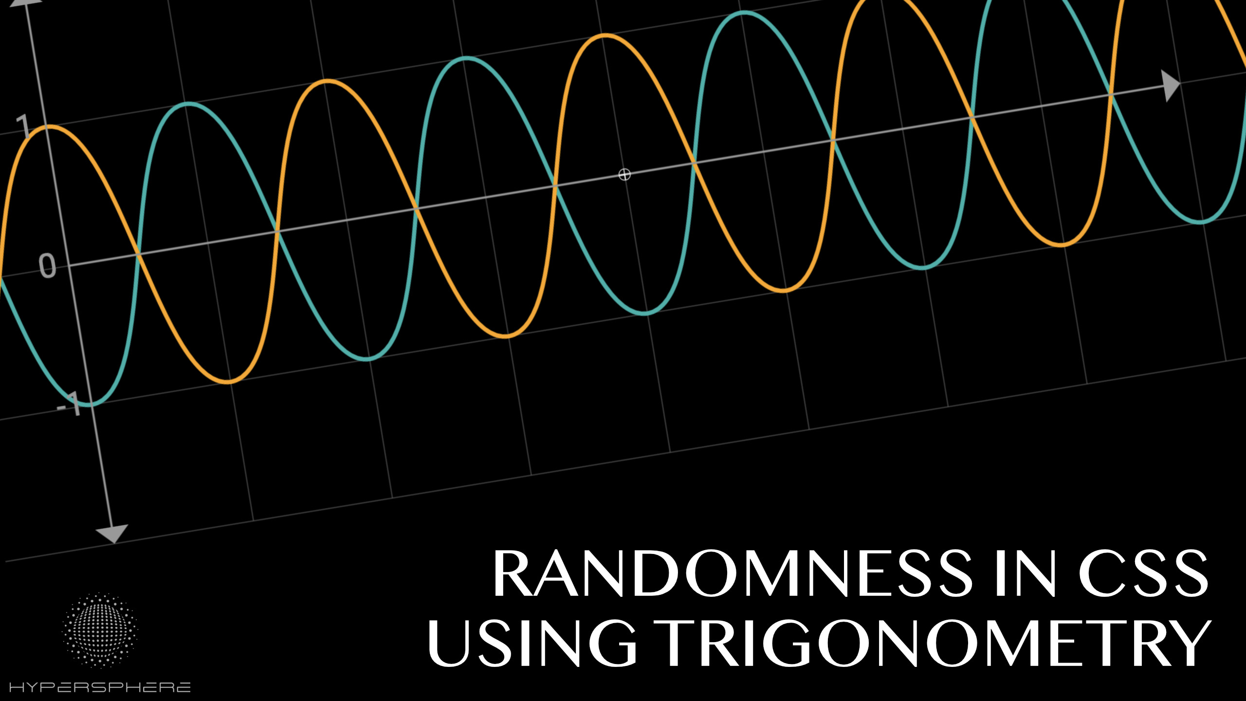
Randomness in CSS using trigonometry
Explore brand new technique to generate random numbers with plain CSS using new trigonometry functions!
In the past, I have covered the topic of pseudo-randomness in CSS using modulo operation and I used prime numbers to create an automatic counter that can be used to generate different values for each object. Thanks to that, we could compute pseudo-random values for each element independently.
As robust as this solution is, it has few downsides:
- The modulo function is not continuous
- It is overly complex: requires 3 variables and
@propertydefinition for each random value we want to generate - Requires using
@propertywhich is not widely supported yet
Fortunately, we can do better! In this article, I would like to propose a better solution using trigonometry.
Better approach
Since the last time I explored this topic, new amazing features arrived in CSS. One of the most exciting additions is the trigonometric functions. They unlock a lot of previously impossible tasks. They are also the first bounded continuous functions natively supported in CSS, making them an amazing tool for creating pseudo-random generators.
Randomness vs pseudo-randomness
Obviously the solution presented here generates pseudo-random values only. All values are computed using predetermined constants. As described in my previous article, we can add an additional --seed variable and change it from the outside of the system (set it in JavaScript on load for example) to provide less deterministic outcome, but CSS does not provide any non-deterministic methods to work with. That said, the solution should be enough to get sufficient pseudo-random values for animations, positions, etc. If you want to use it to solve your cryptographic functions, you might be not using proper technology to begin with 😉
Characteristics of a sine function
Sine and cosine functions are interesting for many reasons. They can be very useful in all sorts of operations where circles and rotations are involved. In our case though, we can use their properties for other purposes.
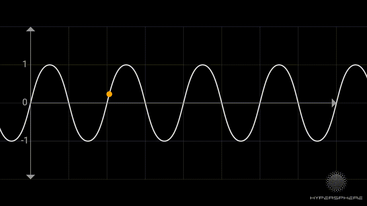
Bounded function
One of the great properties of sine and cosine is that the resulting values are always bounded between -1 and 1. It means, no matter how big or small the value you pass to it, the result will always be a value from this range. Then, we can perform simple normalisation to the range [0,1]. Having normalised values, we can use it to represent any value using simple linear mapping.
--x: calc(0.5 + 0.5 * sin(var(--n) * 342.06184 + 23.434));

/* Then we can use it as following */
background: rgb(calc(50 + var(--x) * 100), 0, 0);
/* Red will be in the range of 50-150.
The code above uses our counter var(--n) introduced in my past article where I use prime numbers to create an effective way to automatically create a counter variable in CSS.
The value is then multiplied and offset by some arbitrary values to provide a pseudo-random big number (the values do not really matter, you can change them as you wish to get different results). After that, we use the sine function to map it to the range [-1, 1]. Lastly, as shown in the animation below, we can map it to the range [0, 1] by applying a simple algebraic transformation. Once we obtain value from the range [0, 1], we can use linear mapping to map it to any other desired value.

Continuity
Another characteristic of the sine function is continuity. You can explore the full formal definition of continuity here, but to make things simple you can think of it that the small changes in the input for sine or cosine function will end up in small changes to the output. Thanks to that we can achieve a gradual change in values when animating while still having the system behave randomly.
Examples
Here are a few examples demonstrating the potential of using trigonometric functions to generate pseudo-random values.
Circles Grid
The first example shows sine properties in action. The generated values are random but we can still maintain order and feeling of continuity when it comes to both colour and size animation.
See the Pen Randomness in CSS using Trigonomentry by hypersphere (@hypersphere) on CodePen.
They key part of the code is computation of x, y, z and w variables which are used to represent red, green, blue and width respectively.
div::before {
  --x: calc(0.5 + 0.5 * sin(4.284 * var(--n)));
  --y: calc(0.5 + 0.5 * sin(7.284 * var(--n)));
  --z: calc(0.5 + 0.5 * sin(4 * var(--n) + 2 * var(--t)));
  --w: calc(0.5 + 0.5 * sin((0.2 * cos(var(--t)/100) + 0.8) * 49.123 * var(--n) + var(--t)));

  background: rgb(
    calc(50 +  100 * var(--x)),
    calc(200 + 30 * var(--y)),
    calc(120 + 100 * var(--z))
  );
  width: calc(50% + var(--w)*50%);
}
The last 2 variables, in addition to our counter --n, use time variable --t which is obtained by running animation that is changing gradually the variable:
@property --t {
  syntax: '<number>'; /* <- defined as type number for the transition to work */
  initial-value: 0;
  inherits: true;
}
:root {
  --t: 0;
}

@keyframes timeOn {
  50% {--t: 30}
}

html {
  animation: 30s timeOn infinite linear;
}
This is the only part of the code that uses @property. To make it work in all browsers, we could just simply update this variable in JavaScript without losing the ability to compute everything else in plain CSS.
Blobs
Randomness can be also used with SVG elements making it a powerful tool when combined with SVG Filters. The demo below was inspired by an amazing CSS-Tricks article The Gooey Effect.
See the Pen Randomness in CSS with Trigonometry using SVG circles by hypersphere (@hypersphere) on CodePen.
Position of each individual blobs is determined using simple formula. The only difference is that we use cx, cy, r and fill to style them as they are SVG elements.
.blobs > circle {
  --x: calc(sin(var(--t) + var(--n) * 74.543 + 432.43312));
  --y: calc(cos(var(--t) + var(--n) * 2.34 + 1.432));
  --v: calc(0.5 + 0.5 * sin(var(--n) * var(--n) * 4.343 + 2.673));

  cx: calc(10vw + var(--x) * 80vw);
  cy: calc(10vh + var(--y) * 80vh);
  r: calc(var(--v) * 5vw + 1vw);
}
To achieve the gooey effect, we use the following SVG filter:
<filter id="goo">
    <feGaussianBlur in="SourceGraphic" result="blur" stdDeviation="15" />
    <feColorMatrix in="blur" mode="matrix" values="1 0 0 0 0  0 1 0 0 0  0 0 1 0 0  0 0 0 22 -11" result="goo" />
    <feBlend in2="goo" in="SourceGraphic" result="mix" />
</filter>
Memphis Pattern
The last demo is an updated version of the example I used in my previous attempt for achieving randomness in CSS where I used the modulo operator. With the new solution, calculations are much easier to understand and modify.
See the Pen Memphis Pattern using Trigonometry randomness by hypersphere (@hypersphere) on CodePen.
This article is also available on my Medium Blog. If you enjoy it, consider heading there and following me for more content.